Researchers: Dr. Michael Barbera, Dr. Stevie Pena, Dr. Ashley Gardner, Wendy Hubbard, and Karolina Muchova
Imagine you’re visiting a website that your friend recommended, then you scroll down to the description of an article and you want to read the remainder of that article. You click on the website where you believe you should click; nothing happens. You click again; nothing happens. You click again and again, nothing happens.
This stressful experience is known as rage-clicking. Rage clicking occurs when a person continuously clicks on a portion of a website where the site should have a click-through option or appears to have a click-through option. After a short period of rage clicking, how likely are you to remain on the website? Multiple studies suggest that users are likely to exit the website immediately after a rage-clicking experience. The user interface included a barrier between the customer and brand, which increased customer effort. The customer is not likely to return.
In a similar act of dedication, you want to order food from a nearby restaurant. After a quick internet search, you learn the restaurant does not have a website and you’re unable to view the menu before you call the restaurant. At this time, those who are dedicated to ordering from this restaurant are likely to search for customer-generated images of the menu on Google, Yelp, or similar websites. After scrolling through 20 photos, how likely are you to order from this restaurant? Similar to the rage clicking experience, the customer’s willingness to purchase significantly decreases with each click or swipe.
Rage clicks are when users repeatedly click (and click and click) in a certain area or on a specific element of your website over a short period of time. Rage clicks typically signal user frustration with your website due to poor page speed, confusion, or broken elements, so knowing what causes rage clicks can help you optimize your page for conversions. The bottom line is: mouse slamming from your customers is a likely sign that something is going wrong. Sometimes people click repeatedly out of habit (more on this later), but rage clicks can indicate user frustration and might be a symptom of something problematic on your site—like dead links, interactive elements that are broken, website bugs, or slowly loading pages—which can help you identify opportunities to improve the user experience (UX).
Although frustrating, rage clicks could provide the insights required to make data-driven decisions for better web design. Here’s what a rage click can indicate:
A misleading button. These are the spots on your webpage that visitors mistake for a button. This could be due to the color, size, or shape of the text or image. Often, our past website experiences give us preconceived expectations of how a website should work. For example, if a line in this sentence were blue or underlined, you’d assume it was a link to another page, yet say it wasn’t linked; you’d probably attempt to click it a few times before moving on. This action would register as a rage click and, in this case, a misleading web element.
Dead links (or dead clicks). If visitors are repeatedly clicking a button on your webpage, it may be because it isn’t reacting the way they expected. In this case, take a look at your CSS selector to verify all links are secure, and your site is free of broken elements.
Slow-loading links. We know that page speed can drastically affect user experience. So, if a link is slow to load, users may become frustrated and rapidly click the button, hoping for a quicker response. We suggest conducting a page speed analysis to determine if you need to optimize your site to increase efficiency.
The desired path. The path that users want to take yet can’t. If you find a specific spot on your page with a high number of rage clicks, this could indicate the most intuitive path for the user. Take advantage of this insight by turning the indicated area into a button — one that would make the most sense for the flow of the page.
Giving users a seamless path from their intended point A to point B makes for a more positive user experience. Rage clicks show us where users get stuck and where we can make adjustments to create a more linear user journey through the site. Brands could benefit from rage click analysis. After all, these actionable insights could help you make improvements that reduce customer churn, increase conversions, and decrease bounce rate. Rage click analysis could be completed with an analytics tool or by conducting in-person usability testing.
During a recent rage clicking study (n = 185), researchers at Clicksuasion Labs measured the impact of rage clicking on consumer decisions with more than 20 variables. Listed within this study, the researchers share three significant concerns when a consumer encounters rage clicking during the consumer journey. The three variables include (1) Net Promoter Score (NPS), (2) Facial Expression Analysis, and (3) Abandoned Cart Behavior.
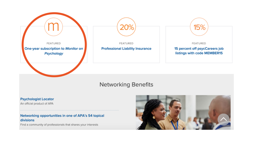
The test was conducted on the website of the American Psychological Association (APA). The participants (n = 185) were provided $30.00 to spend on the website for a book(s) of their choice. The participants browsed the APA website in a lab environment with access to the internet beyond the APA website. The participants were divided into two groups, (1) the control group, and (2) the experimental group. The control group experienced a website without a rage-clicking user design and the experimental group experienced a website with a non-clickable user design.
As shown in figure 1, there are three buttons on the website labeled as (1) “m”, (2) “20%”, and (3) “15%”. Each button was clickable within the control group. Within the experimental group, or non-clickable group, the “m” content link was removed (figure 2); whereas, the “20%” and “15%” remained clickable.
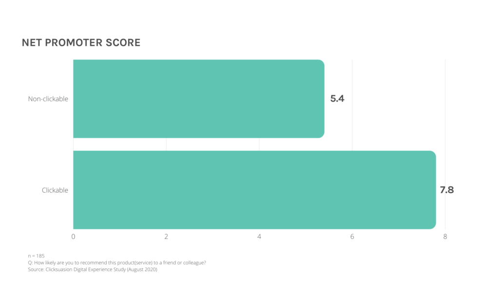
When the NPS was tested (figure 3), “How likely are you to recommend this product or service to a friend or colleague?”, the clickable group reported an NPS of 7.8 and the non-clickable group reported an NPS 5.4. A favorable NPS is reported at eight or greater on a ten point Likert scale. It is evident that participants were less likely to refer the product or service to a friend or colleague when the participant experienced rage clicking.
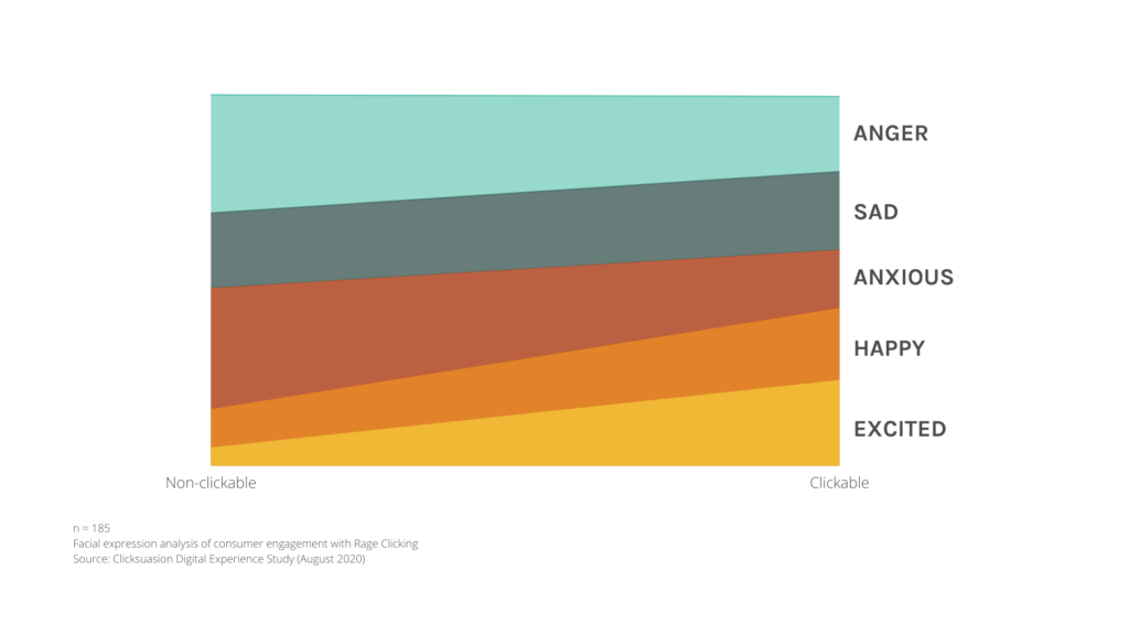
As shown in figure 4, there are five macro facial expressions that were measured within this study, which included the participant’s emotions of (1) anger, (2) sadness, (3) anxiousness, (4) happiness, and (5) excitement. The greater the color representation per category represented the level of emotion detected via facial expression analysis. Most notably, the clickable group experienced higher levels of positive emotions (happiness and excitement) than the non-clickable version. The non-clickable version experienced higher levels of negative emotions (anger and sadness) during the study.
The final variable shared within this article includes the abandoned cart behavior observed during the rage clicking study. Sixty-six percent of products and services placed into e-commerce shopping carts within North America are abandoned. The control group (clickable group) abandoned 64% of products within their cart on the APA website. The non-clickable group abandoned 89% of the products within their cart on the APA website.
Participants were less likely to refer to the brand, product, or service when a negative emotional experience occurred within the digital journey. Additionally, conversions were likely to decrease upon the perception of a non-functioning website and digital experience. Researchers suggest quality assurance testing digital communication channels to identify potential adverse user experiences (including beta testing and pilot studies).


